The postcard is one of the most effective formats in direct mail - immediate, impossible to ignore, and cost-efficient to produce and mail. Unlike a letter that requires an envelope to be opened, a postcard delivers your message the moment it lands in someone’s hands. There’s no barrier between your design and your reader.
That simplicity is also the challenge. Every element has to earn its place. There’s no room for filler, no space for a weak headline to hide, and no second chance if the front of the card doesn’t grab attention in the first second. This guide walks through every decision, from the size you choose before you open a design file to the white space margins that make everything else work.
Postcards are one of the most responded-to formats in direct mail - their open rate is effectively 100%, since the message is visible without opening anything. Every design decision either reinforces or undermines that built-in advantage.
Before You Design - Choose Your Size
Size determines postage rate, and postage rate affects your budget more than almost any other design decision. Choose your size before you open a design file.
| Format | Dimensions | Notes |
|---|---|---|
| Standard postcard | 3.5″ × 5″ to 4.25″ × 6″ | Qualifies for First-Class postcard rate - lowest postage available. Thickness must be 0.009″ - 0.016″. |
| Large postcard | Up to 6.125″ × 11.5″ | Mailed at letter rate. More design real estate, slightly higher postage. |
| Jumbo / oversized | Up to 12″ × 15″ | Mailed at flat rate. Maximum impact - commands attention in any mailbox. |
Aspect ratio matters too. Length divided by height must fall between 1.3 and 2.5 to qualify for automation discounts. Outside that range, you pay a non-machinable surcharge.
The Design Steps
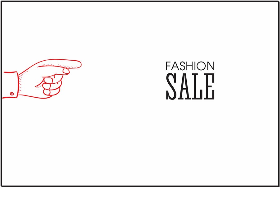
Your headline is the first thing the reader sees and the last thing they need before deciding whether to keep reading. It should communicate your single strongest benefit or most compelling promise in as few words as possible.
Make the most critical phrase larger and bolder than everything else on the card. The eye goes to the biggest, boldest element first - use that to your advantage. A headline that requires three seconds to parse has already lost most readers.
The sub-headline gives readers who are intrigued by the headline one more reason to engage. It should either expand on the headline’s promise or add a second compelling reason to keep reading. Keep it to one or two lines maximum - it’s a bridge between the headline and the body copy, not a paragraph.

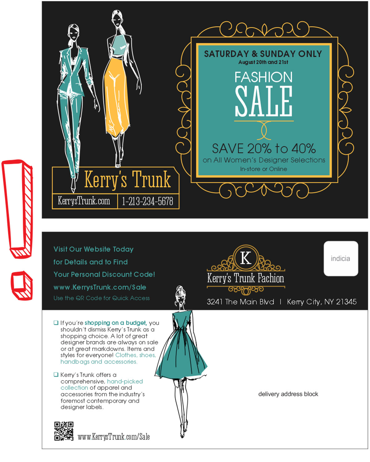
Use one dominant image that supports your headline and offer. The image should either show the outcome the reader wants (happy customers, a finished project, a transformed space) or the product itself in a context that makes it desirable. Avoid generic stock photography that could apply to any business - it adds no credibility and wastes space.
On a postcard, a single strong image almost always outperforms multiple smaller images. Give the main visual room to breathe.

Use your brand’s colors consistently. Contrast is your most important tool - your headline and CTA need to stand out from the background with enough contrast to read in a glance. Dark text on light background or light text on dark background - never low-contrast combinations that require effort to read.
Limit your palette to two or three colors. More than that creates visual noise and makes the card feel cluttered. One accent color used consistently to highlight the headline, the CTA, and key numbers is usually more effective than a rainbow of brand colors all competing for attention.

Choose one font for headlines and one for body copy. Using more than two typefaces on a postcard creates visual chaos. Both fonts should be highly legible at small sizes - this is not the place for decorative or script fonts in body copy.
Size hierarchy is more important than font variety. A clear visual ladder from headline to sub-headline to body copy to CTA guides the eye through the card in the order you intend, without any instruction required from the reader.
Your logo should be present but not dominant. The offer and headline need more visual real estate than your brand mark - the reader doesn’t respond to your logo, they respond to your offer. Place the logo where it provides reassurance without competing with the message.

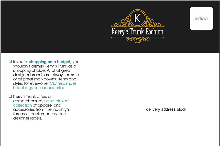
The front of the card has one job: get the reader to turn it over. The back has one job: get them to respond. Don’t try to put everything on both sides. Assign roles and stick to them.
The front should lead with the headline, the dominant image, and a hook. The back carries the offer details, benefits, CTA, contact information, and the addressing panel. The back is also where QR codes, promo codes, and response mechanisms live.
List your top three to five benefits using bullet points or numbered items. Keep each benefit to one line. Lead with the most compelling one - don’t save the best for last. Use bold or color to make each benefit scannable in a single pass.
State exactly what you want the reader to do. One action. Not “call us or visit our website or stop by our store.” Pick the response method most likely to convert for your audience and make it the only CTA. Surround it with enough space that it’s visually unmissable. Add urgency if you can - a deadline or a limited offer - and make the action as easy as possible to take.
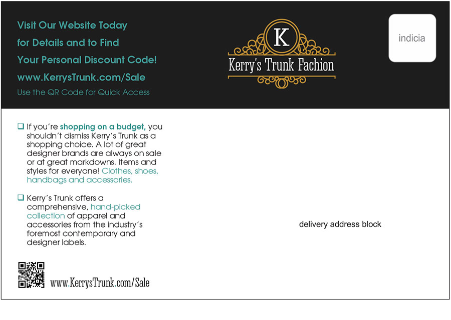
A QR code that links to a dedicated landing page gives you two things: an easy response mechanism for mobile users, and precise tracking of who responded to your mailing. Make the QR code large enough to scan easily (at least 1 inch square), place it near the CTA, and always include a short URL below it as a fallback for people who prefer to type.
The landing page the QR code leads to should match the postcard’s offer and design exactly. Any disconnect between the card and the landing page increases drop-off and reduces conversions.
The offer is what you’re giving the reader in exchange for taking action. It should be the most visually prominent element on the back of the card after the CTA itself. Use a box, a contrasting color, or a size difference to make it stand apart from the surrounding copy. A discount percentage, a free item, or a no-obligation consultation - make it clear and make it easy to see.
Include your phone number, website, and physical address if relevant. Keep font size small but legible - this information exists for the reader who wants to verify you’re a real business before responding, not as a primary design element. Place it at the bottom of the back panel, near the addressing area but visually separated from it.
The USPS requires a minimum clear zone for the addressing panel on the back: the address block should occupy an area at least 3.75″ wide by 1.75″ tall, positioned at least 0.5″ from the right edge and at least 0.625″ from the bottom edge. No design elements - graphics, text, or color blocks - should intrude on this area.
Beyond compliance, white space is a design tool. Crowded postcards feel cheap and are harder to read. Every element needs room around it to register. If you find yourself shrinking type to fit more content, the card has too much content. Cut something.
Before You Send to Print
Check these items before submitting your file:
- All text is at least 6pt and legible at actual size
- The addressing panel is clear of all design elements
- Bleed is set to 0.125″ on all sides
- Images are at 300 DPI at final print size
- The file is submitted as a print-ready PDF with fonts embedded
- Aspect ratio is between 1.3 and 2.5 to qualify for automation rates
Get these right and your postcard arrives looking exactly as you designed it - and qualifies for the postage rate you budgeted for.